Now and then I run into some smart infographic or compilation of data.
It can be anything from Hans Rosling’s fantastic “Gapminder-bubbles” to a simple table of facts. Just recently I came across a couple of interesting one’s that I want to share.
New Scientist – Your Warming World

This is an interactive map showing the average temperatures over the past 20 years, but you can also see maps for earlier periods via a drop-down menu.
You can also click on a place or enter a location to se what has happened with the temperature during the last century.
Works on your computer or on a tablet.
(Click the picture to get there!)
International Energy Agency – Key World Energy Statistics
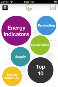
Here the IEA has published its 2012 Key World Energy Statistics through electronic data services – an “App”
(Available at Apple, App-Store and compatibel with iPhone, iPod touch and iPad)
You can of course also download a pdf-version directly on IEA’s homepage if you prefer that format.
(Click the picture to the right)